When you're worried about what to play with? 'time ticket'


Hello??🙌🙌 This is RCtown.
Social distancing has been lifted and more and more people are going out.
The nice weather seems to make me want to go out even more. I'm still thinking about what to do with myself :)
How nice it would be to spend my days off getting some fresh air, eating delicious food, and doing musicals, plays, and daily classes.
So I installed it to find out tickets or daily classes.
Let's analyze 'Time Ticket', which gives off the feeling of a booking app from the name.🎶🎶
Download Time Ticket
https://play.google.com/store/search?q=%ED%83%80%EC%9E%84%ED%8B%B0%EC%BC%93&c=apps

[This app analysis was run on Android.]
Start screen
time ticket
This is a booking site.
The main function of the reservation site is ticket reservation, right? It should be easy to see the reservation history I want and it should be possible to make a reservation quickly.
The main color is white, and white is effective in creating a vast space. It can also give a dull impression.
The point color is ff4a4a, which is perfect for attention-grabbing designs.
Red is also the color used for cautions and warnings to avoid danger.
Using point colors in clean white, it became a very simple site.
In the case of booking, it can seem complicated with a lot of content, but this kind of composition can give a feeling that it does not look complicated because it is neat and arranged.
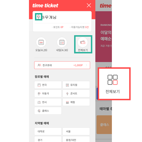
Top
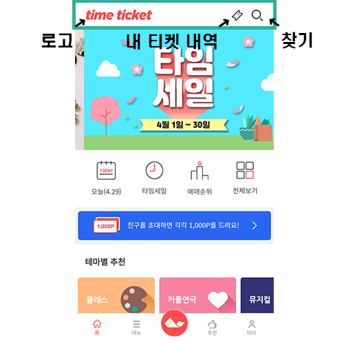
It consists of Logo, My Ticket History, and Find.
I was able to intuitively know that my ticket details would be the details of advance tickets.
However, you cannot view it if you are not logged in.
It's only visible when you're logged in, but it would have been better if you didn't show it when you weren't logged in.
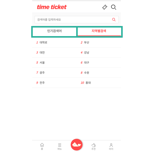
If you press the Find button, the upper part is the part where you can search.
In the middle, popular searches and regional searches come out in 2 depths. When each depth is pressed, an animation that changes color is included to let you know the selected part.
When I saw a search by region, I thought, 'There must be a lot of performances and plays in this area!' I was able to know that.
Making a reservation is also a part that considers user convenience because distance or location is important.
lower
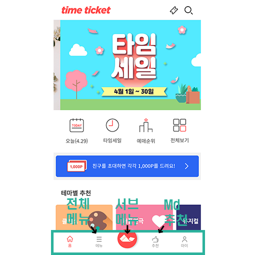
It consists of Home, All Menus, Sub Menu, Md Recommended Menu, and My Page.
It was the sub-menu part that stood out at the bottom and the recommended menu.
The sub-menu buttons were large and colorful, so I couldn't help but notice them.
I also wondered what button it was. However, if you press it, you can see that it was a flexible layout that thought of the user's requirements.
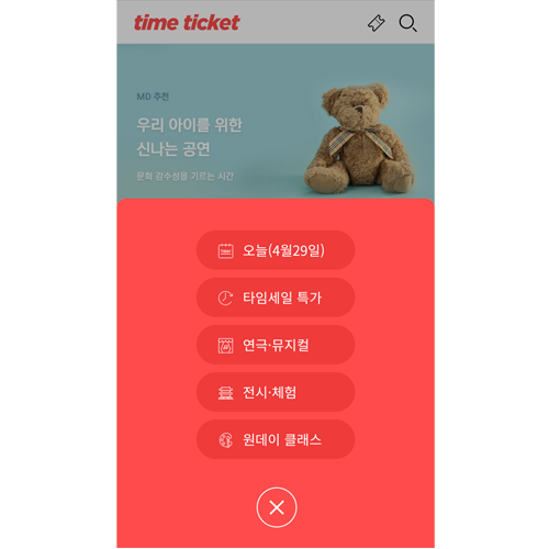
Only 5 main menus are shown, so they are arranged so that you can find the part you want without complexity.
In the case of the recommended menu, when I first saw it, I thought it was showing performances, theater classes, etc. recommended by users in a ranking order.
However, when I clicked it, it contained the contents of the event format.
I felt that the feeling given by the star icon did not convey the purpose that the app wanted to provide.
stop
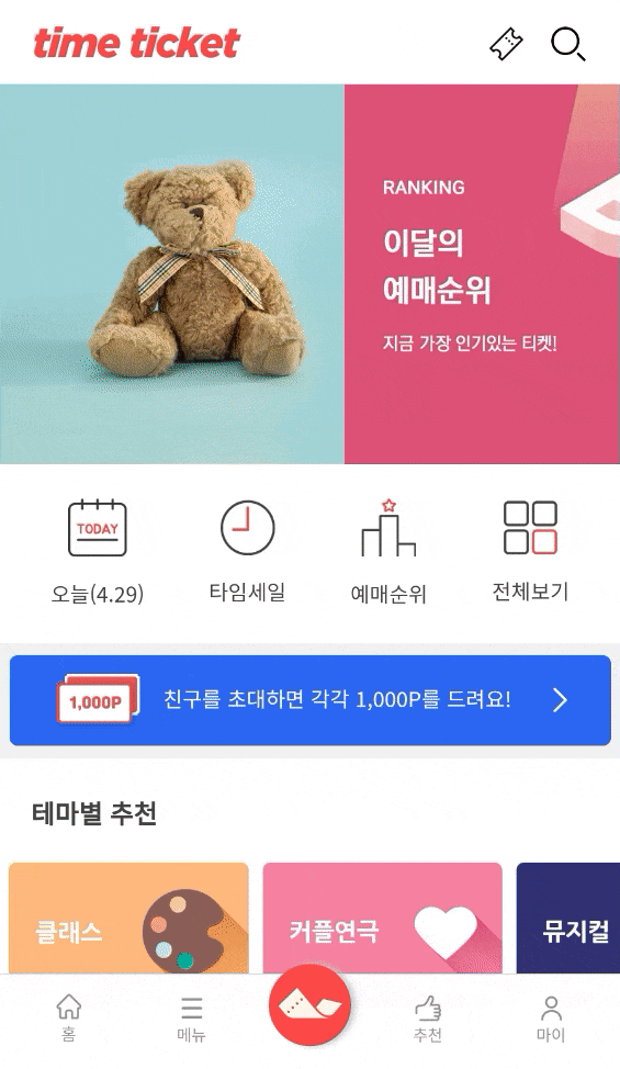
Slider, a frequently used feature.
The peculiarity is that there are no previous and next buttons, and there is no navigation to show how many and which number. That's why it's so fast.
In my personal opinion, if it is this fast, it is difficult to see the content and I do not think that the user moves the screen again to view it.
In terms of design, I think it would be better if we put navigation and slow the slider speed.
This looks like a bug. When I first run the app, the second slider screen is visible and it doesn't launch.
The slider moves when you tap the logo or home screen.
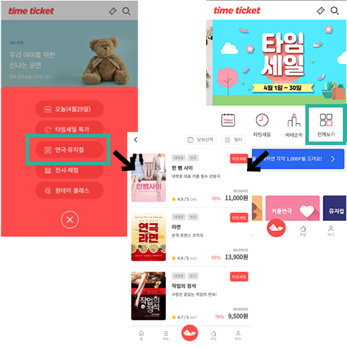
When pressing the full view icon in the main and play in the bottom submenu. The same screen is displayed when the musical button is pressed.
I think it would have been a little more intuitive UX if it showed the whole menu or the menu of the filter function when you clicked View All :)
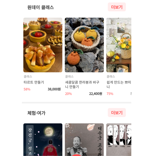
New openings, one-day classes, exhibitions, experiences, and leisure
Slider format allows you to flip sideways to show a lot of content without taking up too much space.
It is in the form of a poster image, focusing on images rather than text, and providing necessary information without superfluity.
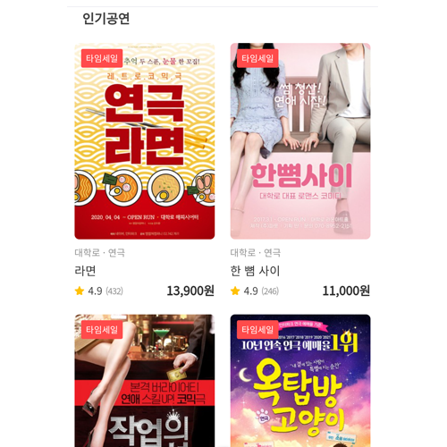
The popular performance part shows two screens per line and scrolls down the screen.
These days, pages like this take the form of sending only a few contents and then pressing the More button to load the next contents.
In the case of time tickets, there is a lot of content, but the view more function is not supported, so you have to scroll a lot to go down to the end, which is inconvenient.
full menu
This is the full menu at the bottom. I am showing my information at the top.
But why is the icon a microphone? It seems like an unintuitive choice. Does it have a different meaning?...
The lower part is the part with the icon that connects to make a reservation quickly.
In the case of full view, it is passed to the screen where you can see the list of works.
If you use the same function as the entire icon on the main screen, it will be a little more unified.
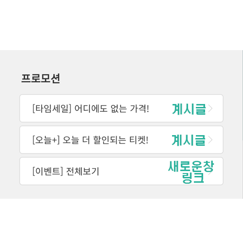
[Event] I thought the full view was the same post as the parent.
It was a link showing another page. Wouldn't it be nice and intuitive to see if it was removed separately? At the bottom, the customer center and business hours are clearly visible.
There are more and more places to hide your phone number, which I really like as a user :)
In the case of the method below, the screen is broken. It also seems buggy.
The page is not working properly.
detail page
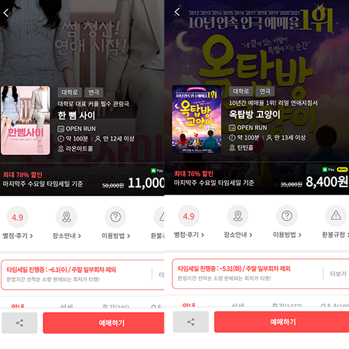
I put a poster in the background.
If the poster title is at the top, it shows the top, and if the title is at the bottom, it shows the bottom.
The fine details are nice.
It shows a poster on a small screen and a simple explanation next to it. It understands the purpose of the user well and shows only the important information.
In my case, I use Naver Pay well. It was good that I did not have to check separately because the payable payment was expressed separately.
As shown in the phrase discount rate and time sale standard, it shows the amount that can be purchased at the lowest price.
The star rating, reviews, location guide, usage method, and refund policy at the bottom clearly and intuitively show the contents.
If you click the reservation button, you can see the date and price accordingly.
There is no clutter and no confusion.
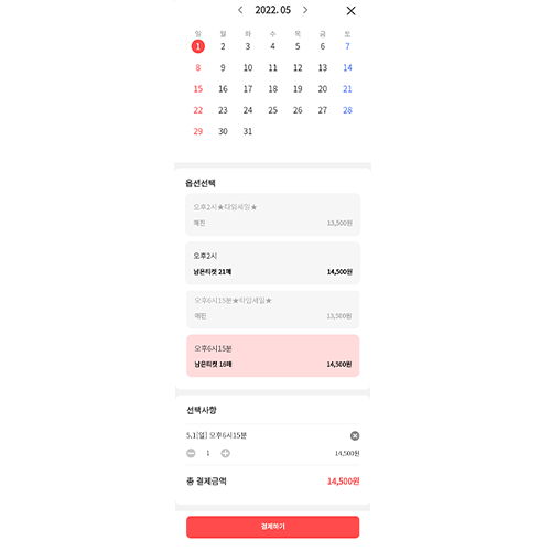
When you select a ticket, a window showing the date, day, time, number of tickets to purchase, and a button to pay appear.
The order payment page shows ticket information and reservation information in an easy-to-see format. It is a configuration that is unlikely to cause many accidental purchases.
I've looked at time tickets so far.
If I have time, I want to go see a Daehangno performance^^

It was an ideal RC town.


댓글
댓글 쓰기