11st App UI UX Analysis Review

Hello~ This is Soft Labs.
Today, we will analyze the mobile app 11st.
Recently, a YouTuber media designer summarized the 10 principles of mobile UI UX very well.
Based on that, let's analyze the 11th Street app.
Analysis is the most important when designing or benchmarking mobile layouts!
Let's find out with 10 mobile principles!! !

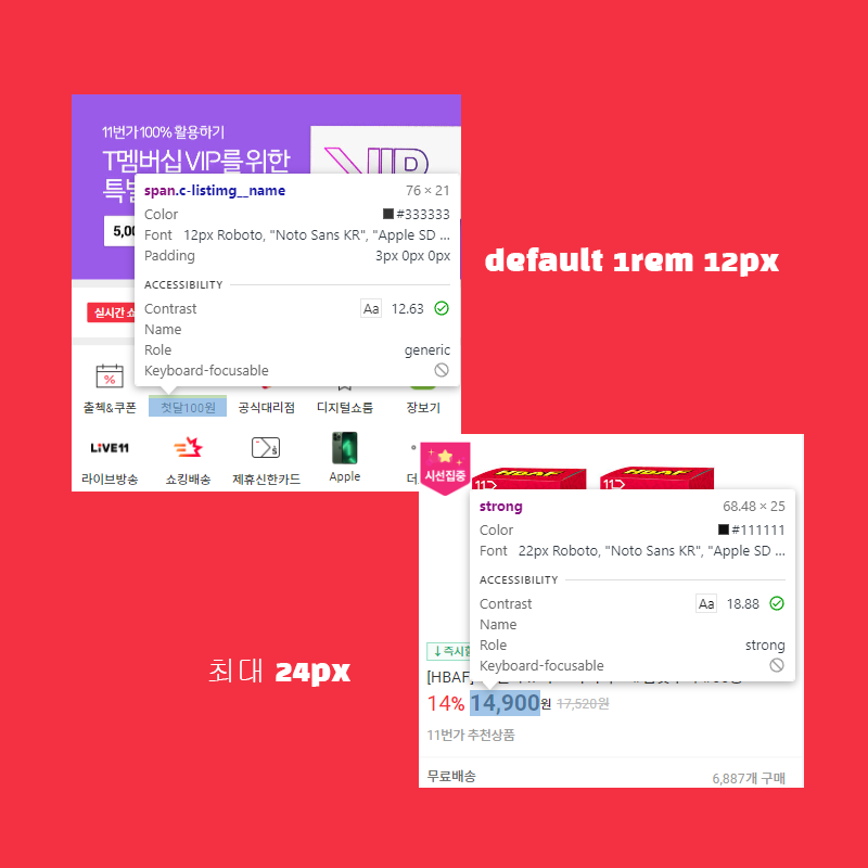
first. font size
Font size is very important in mobile apps.
If it is too large or too small, it is said that the readability of the web app is severely reduced.
So, I write down the principle, but I set it to 12px with 1rem as the default.
It is important to design no less than that. And the maximum size is said to be best not to exceed 24px, which is twice that size.
11th Street seems to be firmly aligned as if to answer that!!

second. increase button size
It is said that the most common mistake when creating a mobile app is to make the button size too small.
However, functional elements such as buttons should increase intuition,
The most important thing is to make the user aware of what it is used for at a glance.
In 11th Street, you can see that the size of the main buttons has increased and the importance is indicated by the color difference.
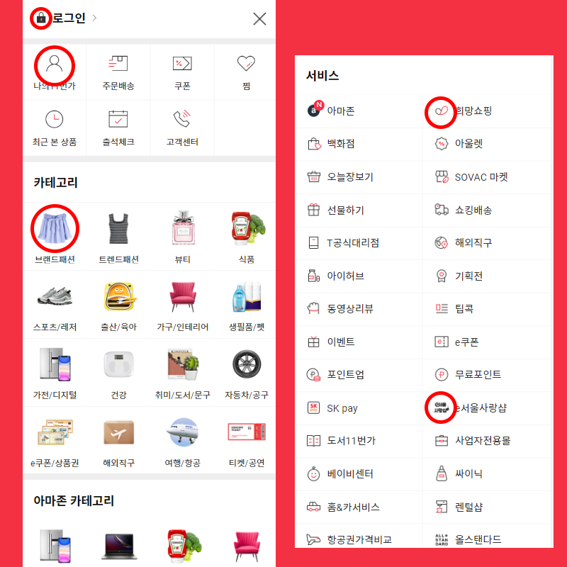
third. unify the icon
It is no exaggeration to say that the icon of a web app represents the image, color, and identity of the platform.
If the number of icons is small, it is not difficult to unify them,
If the number increases exponentially, it can be said that it is difficult to produce icons with the same feeling.

If you look at the icons of 11th Street centered on him, I think you might be a bit curious.
I get the feeling that the icons are different in size and feel.
This is a common phenomenon on platforms with an enormous number of categories, such as 11st or Coupang.
Still, I have a strong feeling that we tried to unify the feeling in terms of functional parts and product categories.
I liked that the other icons were dark gray and accented with 11th Street's unique red color.
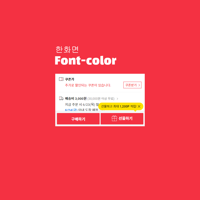
fourth. Accessible font color
The purpose of a font can be clearly conveyed only with color.
That's why they say fonts are the most important.
In the case of 11st, in the case of functions such as registering and receiving coupons, red
In the case of the arrival date of the product, the blue color enhances readability and facilitates intuitiveness.
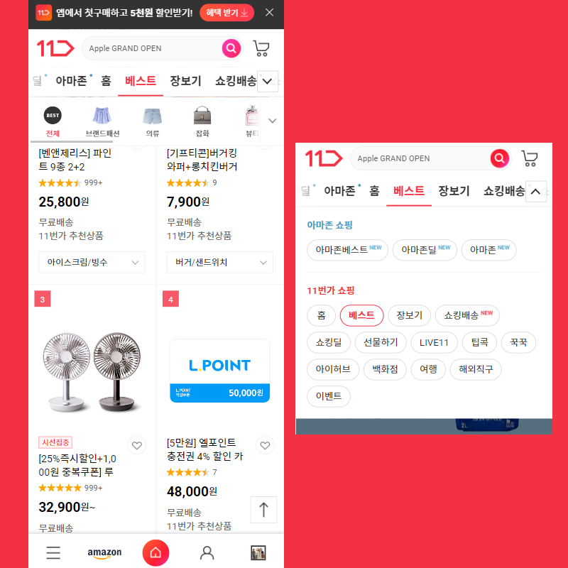
Fifth. unified layout
When people first enter a website, people instinctively look for the content inside.
It is said that the layout that composes it is the first thing that catches the eye.
If it's round, it's round, if it's angular, it's angular, and so on.
11th Street seems to have chosen an angular and falling layout.
I don't even see that common border-radius.
This angular design enhances the reliability of the platform and makes it feel like it will do the job well.
If you do it wrong, it can make it look like you didn't care about the design.
11th Street seems to have been well made so that it corresponds to the former.
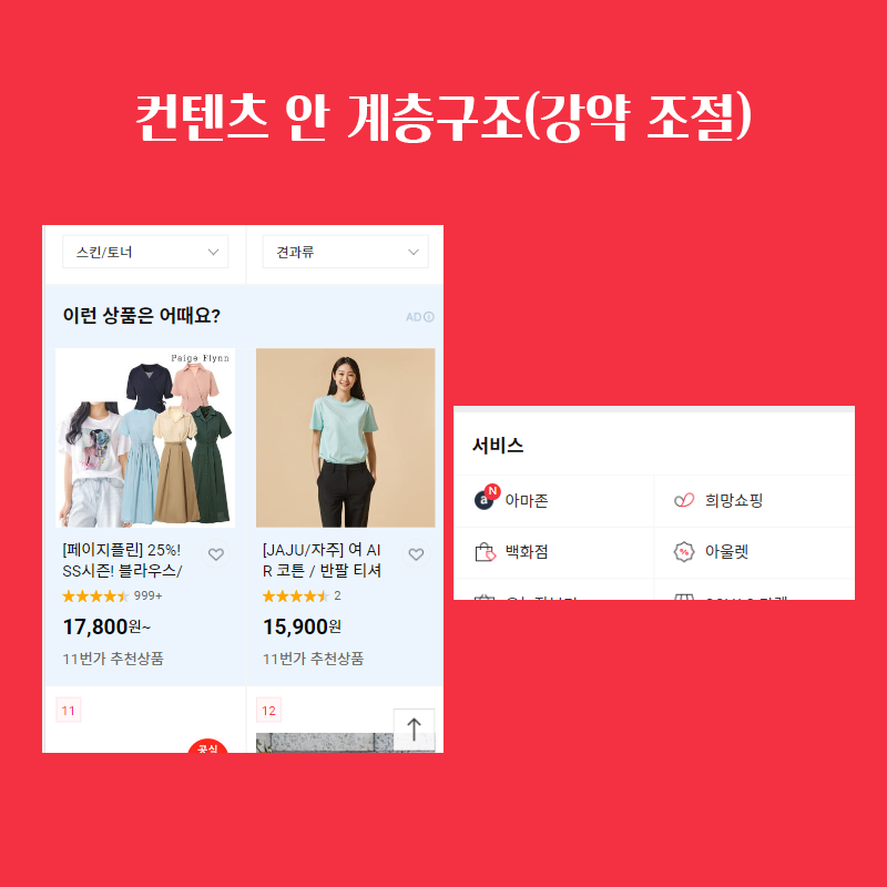
sixth. Hierarchy in content
In fact, as explained above, an angular design can, if done incorrectly, make the design look less cared for.
In this case, if the dynamics are adjusted by expressing the hierarchical structure between contents,
It can make something colorful and full of content.
In 11th Street, the theme was expressed well by increasing the font size or adding thickness to important parts,
The special part in the white background, which can be boring in some ways, is
You can see that the background-color is a subtle highlight.

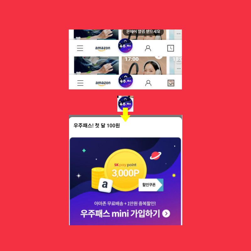
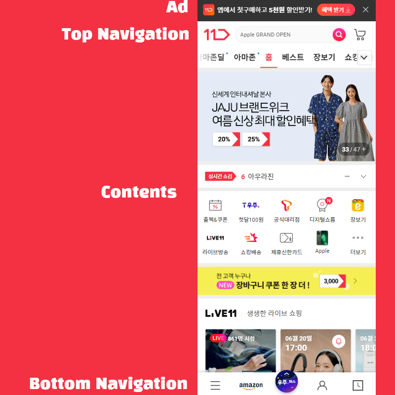
seventh. bottom navigation bar
I didn't expect the bottom nav bar to come out as one of the principles.
The bottom nav bar seems to fit well in mobile UI these days.
Being at the top is definitely not enough.
The most important thing about bottom navigation is intuitiveness and readability.
Because icons form the main part, we look only at the shape of the icon.
The user should be able to tell right away what that button does.
And too many of them can make it hard to read, so you need to be able to pick out the really important parts!
In the case of 11th Street, there were some strange parts.
In the case of the hamburger bar (menu button), Amazon, and My Page, I could immediately recognize what the icons did.
There was an awkward part to immediately notice the space pass advertisement button or the product list button.
I wondered if it should be on the nav, but what do you guys think??
eighth. White space between content
It's called margin. Spacing between content affects the readability of the site.
It lifts it up and makes it look more relaxed aesthetically.
On the web, scroll length doesn't matter much on mobile.
In 11th Street, it feels a little less relaxed.
The spacing between content is about 8px.
It may be so if there is a lot of information contained in it, but when I saw it in actual mobile
I didn't feel very uncomfortable, but I did feel that it was a little tight.
ninth. Grouping between content.
Grouping between contents is a major classification of categories and visualizes them.
This is the key to being able to differentiate.
It is important that you can find the purpose you want to use more easily and that there is no inconvenience for users to use it.
In this part, I feel that 11th Street has done a very good job of categorizing.
I got the feeling that even if I didn't read the text, I could tell what category the item I was looking at just by looking at the layout!
tenth. layout
Mobile devices are not as large as desktops.
So when you're laying out your app, if it's broken down too finely, something looks complicated and doesn't catch your eye.
It would be better for the user experience to see information one by one, right?
In the case of 11th Street, it is divided into large groups.
The content inside is easy to see. I think the gap could be widened a bit more.
I think, but the overall texture is solid and not uncomfortable to look at.
Categories are divided into small pieces, but 11th Street has a lot of categories, so I think it can be.
how was it?? In the future, our Soft Labs will develop a UI UX-based
We plan to analyze the web app through theory and benchmarking and post a review.
I'll work hard on it, so please leave your thoughts in the comments!
In the future, easy-to-use and good-looking apps
We hope that there will be many more, and we will greet you here! thank you

댓글
댓글 쓰기